Thursday, February 17, 2011

Menil Visit.

This was the first time I have ever been to an art museum, very interesting.  I liked it alot, but some of the art work made me realize you can just paint a large canvas one solid color and have one black strip going down the middle, and an art museum will pay you a large sum of money.  Awesome!

 Ancient Figure:
Jug
Greece, Cycladic Islands
Early Cycladic II, 2700-2200 B.C.
Terracotta


Vija Celmins painting:
Vija Celmins
T.V., 1964
Oil on canvas


Non Representational Painting:
Barnet Newman
Now II, 1967
Acrylic on canvas


Art from Southern California:
Lary Bell
Untitled, Ca. 1966
Coated glass and silver plated brass.


Traditional African Mask:
Mali, bamana, and Maninka
Cow Mask (Misikun) 20 century.
Wood


Artwork by Max Ernst:
Max Ernst
Oiseau (Bird), Ca. 1925
Oil on cavas


Writing Assignment:

A. Which was your favorite of the things you saw? Why? Does it use repetition/rhythm? If so what formal elemnts are being repeated?
One of my favorite things I saw during my walk through of the Menil was a surrealism painting done by Yves Tanguy, called Le Ciel Traque (The Hunted Sky).  The color choice and the metallic 3D look grabbed my attention.  Even though the colors were gloomy, it seemed to glow.  It was a very modern painting.  Tanguy used repetition/rhythm throughout this painting by repeating the color, shapes, and textures.


B. What peice in the museum is the most like something you might make yourself, or would like to make?
If I wasn’t going to become a photographer, then I would like to create art like Rene Margritte.  The surrealism paintings drew my attention, and her art looked like something I would create if I could paint.    
C. Get a copy of the handout that goes with the temporary exhibition "Kissed by Angels: A Selection of work from Southern California."  Read the essay about LA's "Cool School."  Choose a work in the show that is not described in the essay, and tell how you think it fits or doesn't fit into the show's theme.  Be sure to include the piece's title, artist and date, and to support your ideas with specific descriptions of works in the show.
The essay about LA’s “Cool School” says that the artists in California are trying to create a different look than what California is perceived to be.  When people think of California they think of Disney Land or Hollywood, and the artists are trying to get away from this.  With their art they are creating a cooler look, less analytical, more subtle, and economical.  In the exhibition “Kissed by Angels,” there was a painting called Aloha Draculas, by Billy Al Bengston 1980.  This painting I think doesn’t fit in with the rest of the art work in the exhibition.  He uses bright reds, yellows, and oranges to paint a sunset.  The rest of the art in there dealt with cool colors and revealed a sense of calm.  
D. Vija Celmins was also working in Los Angeles in the 60's.  Her show is titled "Television and Disaster," and has a markedly different feel from the work in "Kissed By Angels." Get the handout and read the essay that goes with her show.  Compare the two shows: what concerns do these LA artists have in common? Where do they difffer?
  Vija Celmins and the artists in “Kissed By Angles” are similar because they both are trying to use their art to move away from something.  In “Kissed By Angles” the artists are trying to move away from the typical California persona. While Vija Celmins is trying to move away from the diaristic subjectivity and juicy emotive content that had defined the action painting of the New York School.   They are very different also, Vija Celmins depicts real objects, where as the artists in “Kissed By Angles” create more abstract art. 

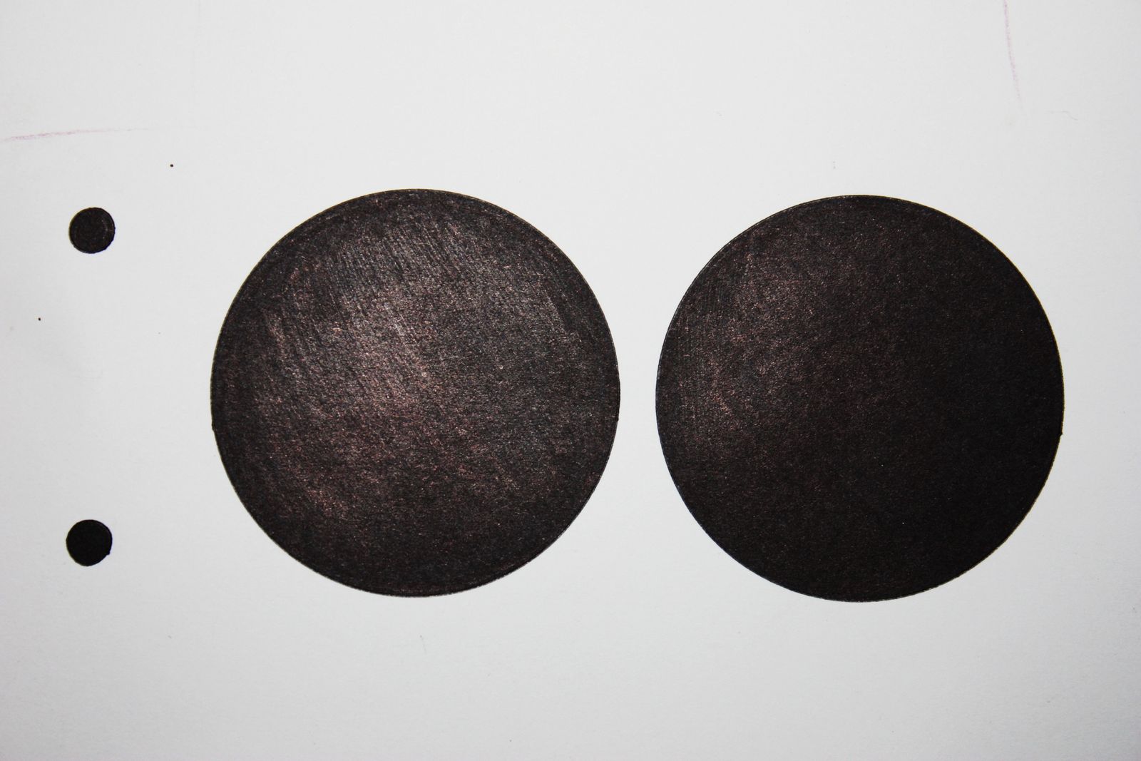
Human Dot Composition.

My two human dot compositions:


The Dot Compositions (not human) that I followed for the human comp.:


How our group rated ourselves:

5 = Craft of Documentation
  • Our size and printing of our photographs were consistant.
4 = Use of White or Negative Space. Why?
  • We put creativity into the white space.  The paint and wrinkles of the white space go along with our theme.  We could have used something different for a white background, but it worked.
5 = Dots. Why?
  • Appearance of dots are very prominant.  Creative use of body parts
5 = Human Element. Why?
  • Obvious....
5 = Theme and/or Meaning. Why?
  • Ruff, edgy, raw, nude.  To show that we were tired of the precise and prestine dot compositions before.
4 = Group Process. Why?
  • We worked together well, and all became a little more comfortable with eachother! Everyone was prepared and brought the materials they needed.  The only problem was it was crowded behind the white sheet of paper.  Other than that we worked together just fine.
Fun project!

Negative Space Photos


Here is the grades Nick C. and I gave myself...


Sunday, February 13, 2011

Play Date With Object.

Crayons!


Im going to create something sort of like this from Herb Williams a crayon fanatic.

Wednesday, February 9, 2011

3d Map on Wall

To create this map I spent hours of tedious work gluing cardboard together and pasting newspaper...this is what i finished with.

Here are multiple views of the map...


We had random people from our class critique it and this is what they told me.

-Craftmanship: 
  • Clean cut newspaper and cardboard
  • Hot glue is visible
  • Nice use of color
- Concept: 
  • Couldnt tell what concept was being conveyed.
  • But concept isnt important to the peice.
- Impression
  • Wow
  • Pops in and out


Human Composition Team Brainstorming.

Here are 10 different ideas me and my table brainstormed

1. We all wear white head to toe, standing on a white floor.  Each of us hold a white cup of black paint.  Take the picture from up above.

2.  Make a frame of plywood, paint it white and put a sheet of white paper over it.  Cut holes in the paper where the dots go, paint our faces black and look out of the holes.

3. All white background and clothes, black ski masks.  Pose like we are running away in corolation with the dots.

4.  Everything white, black glove on one hand.  We lay down and make a upward fist with the black glove.  Then take a picture from above.

5. Sit in trash can all black, floor and all around is white, look up at the camera.

6.  White everything and clothes, and then we each wear a black fro.  Disco ball going on.  take picture from up above or head on.

7.  Paint faces black just like #2, but one person pants their butt black and moons the camera through the hole in the white paper.  The faces looking out are looking at the butt.

8.  Close up picture of face, one half is one composition and the other half is the other composition.  Paint it black and use white dots.

9.  Create a sign and use our bodies as the brail underneath the word.

10. Dye our mouths black, open mouth on all white contrast

Repetition and Rhythm Photos.

Here are some repetition and rhythm I found while taking a stroll through campus.